

WELCOME:
MEET/GREET
Welcome to the ultimate showcase of future design legends—our Graphic Design Seniors of 2026! These nine talented students have spent years mastering print, digital media, and illustration, and now they’re ready to show off their coolest, quirkiest, and most groundbreaking visual theses at Made Mobb Gallery. Join us on May 3rd for an evening of creative chaos, inspiring ideas, and maybe even a few “Wow, I wish I thought of that!” moments. Whether you’re a design enthusiast, a future client, or just someone who loves to see young minds blow up the art world—this is the event you don’t want to miss!
This event is more than an exhibition — it’s a celebration of emerging talent and a preview of the innovative ideas shaping the future of visual arts. Attendees will have the opportunity to engage with the students, view their creative processes, and celebrate their accomplishments.
2026 graphic design SENIORS
2026 graphic design SENIORS
〰️ MADE MOBB | KANSAS CITY |
MAY 03, 4PM-7PM
2026 graphic design SENIORS 〰️ MADE MOBB | KANSAS CITY | MAY 03, 4PM-7PM
Welcome to the ultimate showcase of future design legends—our Graphic Design Seniors of 2026! These nine talented students have spent years mastering print, digital media, and illustration, and now they’re ready to show off their coolest, quirkiest, and most groundbreaking visual theses at Made Mobb Gallery. Join us on May 3rd for an evening of creative chaos, inspiring ideas, and maybe even a few “Wow, I wish I thought of that!” moments. Whether you’re a design enthusiast, a future client, or just someone who loves to see young minds blow up the art world—this is the event you don’t want to miss!
Enter into the mindset and thesis of our seniors and discover their incredible journey! Take a tour through their portfolios and theses to witness the exciting experiments and passionate creations they are producing within their own body of work. Prepare to be inspired by their innovation, dedication, and unique perspectives!
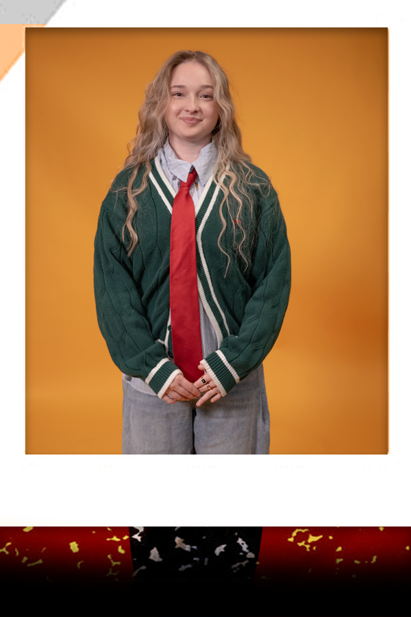
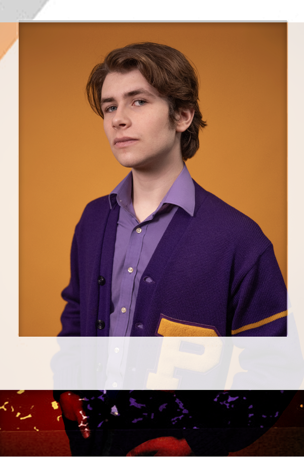
Jasmine Harmon Independence, MO.
Digital Illustrator/Print Design.
TITLE: Jazz of All Trades: Embracing Versatility in Multidisciplinary Design
(attended William Chrisman High School)
“Jazz of All Trades” explores the value of multidisciplinary design within a field that often emphasizes specialization. Inspired by the phrase “Jack of All Trades,” this thesis reimagines versatility as a strength by using the metaphor of a playing card deck, where each suit represents a different design discipline. This concept underscores adaptability, balance, and intentional decision-making, illustrating how holding a full deck enables designers and creatives to respond thoughtfully across various mediums, audiences, and visual languages. The project involves designing a 54-card playing deck for creatives, with each card featuring bold, colorful visuals. The face cards; Jack, Queen, and King symbolize different creative skills and mediums such as branding, illustration, social media marketing, and editorial design, transforming a familiar object into a conceptual system that reflects the diversity and adaptability required in today’s creative landscape.
Rooted in a “Jack of All Trades” philosophy, this thesis emphasizes the power of versatility, cross-functional thinking, and creative problem-solving across disciplines. By integrating multiple areas of design including branding, editorial, poster, advertising, and digital content creation. The project aims to build cohesive, story-driven experiences that connect ideas across platforms. This multidisciplinary approach fosters a curious, agile mindset that thrives on experimentation and collaboration, ultimately leading to impactful visual solutions. The thesis advocates for embracing a broad skillset in the creative industry, demonstrating that versatility is not a weakness but a dynamic strength that enables designers to navigate and excel in an ever-evolving landscape.
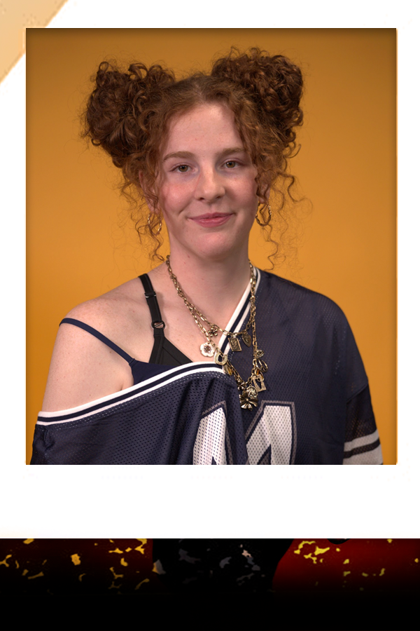
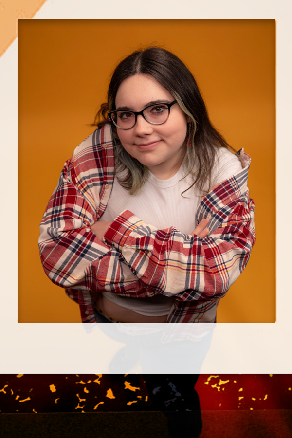
Allison Swank
Pomona, KS.
Digital Illustrator/Print Design.
THESIS:
TITLE: Exploring with Bluff and Melly
(attended West Franklin High School)
Exploring with Bluff and Melly is an illustrated children’s book that follows two curious characters as they embark on an imaginative journey of discovery and adventure. Created for a young audience, the story emphasizes themes of curiosity, friendship, and the excitement of exploring the unknown. Through engaging storytelling and vibrant visuals, the book encourages children to step outside their comfort zones and view the world with a sense of wonder. The project combines narrative development with intentional visual design to create an experience that is both entertaining and meaningful for early readers.
This thesis argues that illustration plays a critical role in shaping how children understand and connect with a story. Through the development of Bluff and Melly’s characters, the use of color, composition, and expressive design choices, the visuals work alongside the narrative to guide emotional engagement and comprehension. By documenting the creative process, from concept and character design to final layout, this project demonstrates how thoughtful illustration can enhance storytelling, support literacy, and foster imagination in children’s literature.
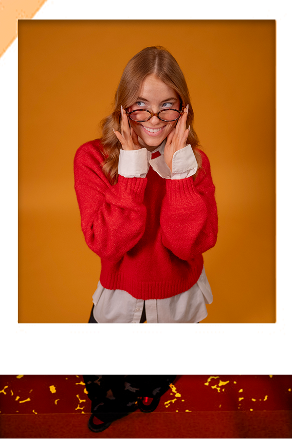
Abigayle Easley
Kansas City, MO.
Editorial/Print Design.
THESIS:
TITLE: Emotional Connections through Food: Visual Storytelling and Design in Brand Experience
(attended Blue Springs [Mo.] High School)
This thesis explores the profound connection between emotion and food through the principles of visual storytelling, combining illustration, graphic design, and fine art to evoke emotional responses and foster meaningful connections with audiences. As an illustrator, studio artist, and graphic designer, I am passionate about creating imagery that communicates, inspires, and engages. My practice involves blending diverse mediums to translate complex ideas into compelling visuals, utilizing elements such as color, texture, and form to push creative boundaries. Art is not just my profession but a way of perceiving and interpreting the world, with each project serving as an opportunity for growth, experimentation, and storytelling. This approach underpins my work, which aims to reflect my passion while inviting viewers to connect on a deeper emotional level.
Centered on Moody Oven Baking Co., this project uses visual communication—through color, typography, layout, and hand-drawn imagery—to express and evoke specific moods associated with baked goods and recipes. The design process demonstrates how illustration and visual systems can create an immersive, emotionally engaging brand experience. By examining the ways in which food can serve as a medium for storytelling, the thesis illustrates how strategic visual design can deepen audience engagement and transform a simple product into a rich, expressive narrative. Overall, this work underscores the power of visual storytelling in crafting emotional connections and enhancing brand perception through thoughtful, evocative design.
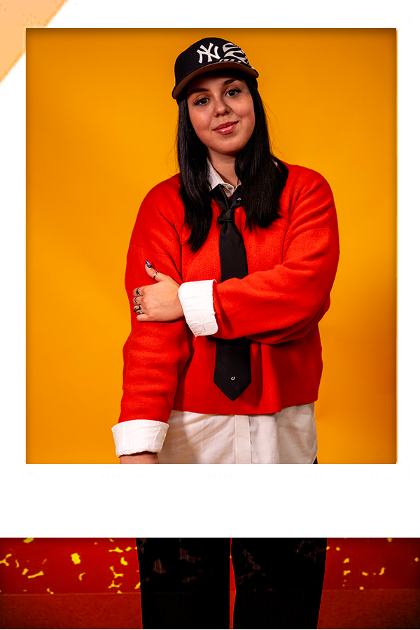
Azalea Calderon
Kansas City, MO.
Editorial/Print Design.
TITLE: “Kindness Campaign”
(attended Park Hill High School)
My thesis focuses on addressing pressing political and social issues that affect our country, with particular emphasis on themes such as equality, world peace, injustice, and community. I am deeply committed to raising awareness and shedding light on these important topics by using my artistic skills to create visually compelling designs. My goal is to communicate powerful messages through posters, prints, apparel, and other merchandise that can resonate with a broad audience. I believe that art has the ability to inspire change and foster understanding, and I want my work to serve as a platform for dialogue and activism. The themes I have chosen are meaningful and relevant, and I hope to use my designs to spark conversations and encourage action on issues that matter most to my community and beyond. By combining visual art with social commentary, I aim to make a positive impact and contribute to a more informed and engaged society.
The four main topics I plan to explore are ending war, promoting equality, standing up against I.C.E and their abuse of power, and encouraging civic participation such as voting and community involvement. These issues are broad enough to encompass a wide range of related concerns, yet they are also deeply personal and close to my heart. Through this project, I hope to foster awareness, inspire action, and bring communities together by visually communicating these critical issues. Ultimately, I want my work to serve as a catalyst for positive change and a reminder of the importance of staying engaged with the world around us.
Aidan Mazeitis Kansas City, MO.
Branding/Identity Systems.
TITLE: The Intersection of Digital Art and Traditional Illustration: Enhancing Traditional Work through Digital Means
This project demonstrates how digital tools can elevate and complete traditional illustrations by combining their strengths—using pen and ink linework and shading alongside digital coloring to produce vibrant, precise results. The process preserves the energy and expressiveness of the original hand-drawn artwork while achieving colors that are difficult to replicate with traditional mediums alone. This integration allows for a dynamic interplay between the tactile quality of traditional techniques and the polished finish provided by digital enhancements.
For my senior thesis, I created an illustrated picture book to accompany a record in a collector’s vinyl package, along with various related products. The 20-page book features illustrations for "The Devil Went Down to Georgia" by The Charlie Daniels Band, crafted traditionally with pen and ink, employing hatching and stippling techniques. These drawings were scanned, digitally enhanced, and colored with subtle highlights and shadows. I designed the page layouts in Adobe InDesign and refined the artwork in Adobe Illustrator, including final adjustments. The physical copy was produced using perfect binding and included a printed dust jacket. This project allowed me to expand my skills in character design, typography, layout, and my illustrative style.
Lauren Buck
Kansas City, KS.
Digital Illustrator/Print Design.
THESIS:
TITLE: Tails of Trouble (Comic)
(attended Sumner Academy of Arts and Science)
Tails of Trouble is a four‑panel fantasy webcomic developed as my senior thesis in Graphic Design. The series follows two small, fairy‑like animal characters who observe humans from the outside and attempt to understand human behavior, culture, and emotion. Their misunderstandings become the core of the humor, blending light snark with lighthearted commentary on everyday life. Visually, the project draws from classic newspaper and paperback comic traditions, particularly the pacing and simplicity of early Garfield collections, while incorporating my own warm, cartoon‑influenced style. Through iterative sketching, character exploration, and research into anthropomorphic storytelling, the project examines how animal‑based characters can act as mirrors for human identity. This portfolio presents the evolution of the comic from rough, hand‑drawn drafts to refined digital pages, highlighting how format, timing, and character design shape comedic storytelling in contemporary webcomic culture.
Faith McMillin
Liberty, MO.
Print/Editorial Design.
THESIS:
TITLE: Sunnies Branding/Identity Systems Campaign
(attended Colégio do Sagrado Coração de Maria)
Our thesis introduces a sunglass brand called “Sunnies” that helps solve the problem of finding affordable sunglasses that are both stylish and effective. As young adults who love fashion, we often view sunglasses as an accessory to our outfits, meaning we tend to gravitate towards the pair that matches our outfit the best rather than the pair that is most cost effective or practical. Whether we’re dressed fancy, athletic, or grungy, we want a pair of sunglasses that gives off the same vibe as the outfit we choose for the day. However, having multiple pairs of sunglasses can become very expensive, especially if you are buying good quality glasses from designer brands. Our goal for this brand is to create a system that screams with style, quality/stability, and affordability for all ages. Due to our target audience being the young adult market, including ages 18-25, all of our brand’s identity systems are designed to be trendy and appeal to the younger generations. While we would still produce collections for all ages, we geared the majority of our branding pieces towards the young, vibrant, and luxurious styles that young consumers love. This translates into our color scheme, which is bright and modern, to give the brand an overall chic feel. We also focused on finding a typeface that matched our modern aesthetic, but added a soft touch with smooth curves to match our sun logo. Across the entire brand, we strived to create a cohesive vibe/aesthetic throughout each piece that helped write the narrative of our brand in a visual manner.
Clarisse Ferreira
Lisbon, Portugal.
Print/Identity/Marketing Design.
TITLE: Sunnies Branding/Identity Systems Campaign
(attended Colégio do Sagrado Coração de Maria)
Our thesis introduces a sunglass brand called “Sunnies” that helps solve the problem of finding affordable sunglasses that are both stylish and effective. As young adults who love fashion, we often view sunglasses as an accessory to our outfits, meaning we tend to gravitate towards the pair that matches our outfit the best rather than the pair that is most cost effective or practical. Whether we’re dressed fancy, athletic, or grungy, we want a pair of sunglasses that gives off the same vibe as the outfit we choose for the day. However, having multiple pairs of sunglasses can become very expensive, especially if you are buying good quality glasses from designer brands. Our goal for this brand is to create a system that screams with style, quality/stability, and affordability for all ages. Due to our target audience being the young adult market, including ages 18-25, all of our brand’s identity systems are designed to be trendy and appeal to the younger generations. While we would still produce collections for all ages, we geared the majority of our branding pieces towards the young, vibrant, and luxurious styles that young consumers love. This translates into our color scheme, which is bright and modern, to give the brand an overall chic feel. We also focused on finding a typeface that matched our modern aesthetic, but added a soft touch with smooth curves to match our sun logo. Across the entire brand, we strived to create a cohesive vibe/aesthetic throughout each piece that helped write the narrative of our brand in a visual manner.
Magdalene Giar Waverly, MO.
Print/Identity/Marketing Design
TITLE: Bridging Tradition and Innovation: The Artistic Relevance of Hand-Illustrated Planners
(attended Cornerstone Family Schools, Topeka, Kan.)
Rendezvous is a 2026 weekly planner notebook adorned with lovable animal illustrations that underscore the lasting importance of traditional illustration techniques. This project explores how illustration is transforming through a blend of classic styles and digital refinements, particularly as a response to the growing influence of artificial intelligence. In an era where digital programs like Procreate have diminished the emphasis on manual techniques such as ink and watercolor, this campaign advocates for embracing the imperfections and authenticity inherent in hand-drawn art. These tiny, detailed characters are designed to bring a sense of genuine joy and authenticity to the everyday lives of users, emphasizing that traditional illustration retains its relevance and emotional resonance in a rapidly evolving digital landscape.
By integrating hand-illustrated figures into a functional object, this project demonstrates how artistry and utility can coexist harmoniously. It highlights the importance of maintaining foundational skills in illustration despite technological advancements, asserting that the human touch remains vital in contemporary design. Through this approach, Rendezvous celebrates the enduring value of traditional techniques, proving that they can complement and enrich modern digital practices. Ultimately, the project champions the idea that authenticity and craftsmanship in illustration can continue to inspire and connect people in the digital age.